
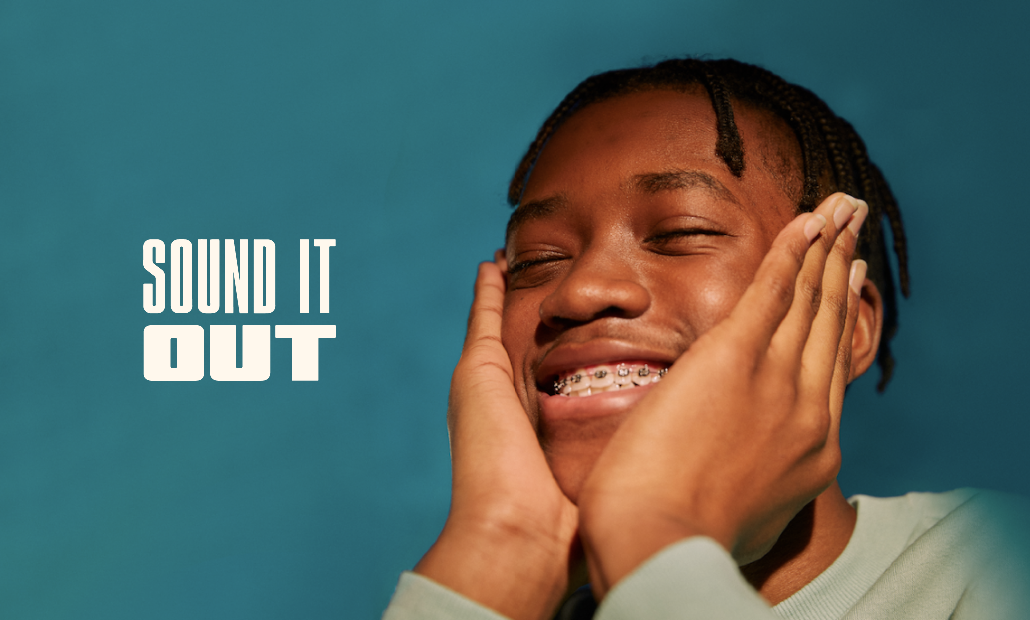
Sound It Out
Sound It Out is a campaign that offers educational resources and activities from expert advisors to help Black and Brown parents and caregivers learn and practice healthy emotional wellbeing. This campaign is lead by Ad Council, in partnership with Pivotal Ventures, and a coalition of organizations.
MY ROLE
Lead Designer
TEAM
Melissa June, Maddi Rain, Taylor Desmangles


THE ASK
Conduct a brand and social media refresh that reaches Sound It Out’s target audience, parents and caregivers of middle schoolers (age 10-14), with an emphasis on reaching Black and Hispanic/Latinx caregivers.
CHANNEL AUDIT
In collaboration with our strategy and experiential department, we conducted a discovery session with the client to learn about their stories, needs, and vision for the look and feel.

DESIGN PRINCIPLES
Using our discovery session as a guide, our team established design and experience pillars to guide us through the creative and strategy process.

BRAND VALUES
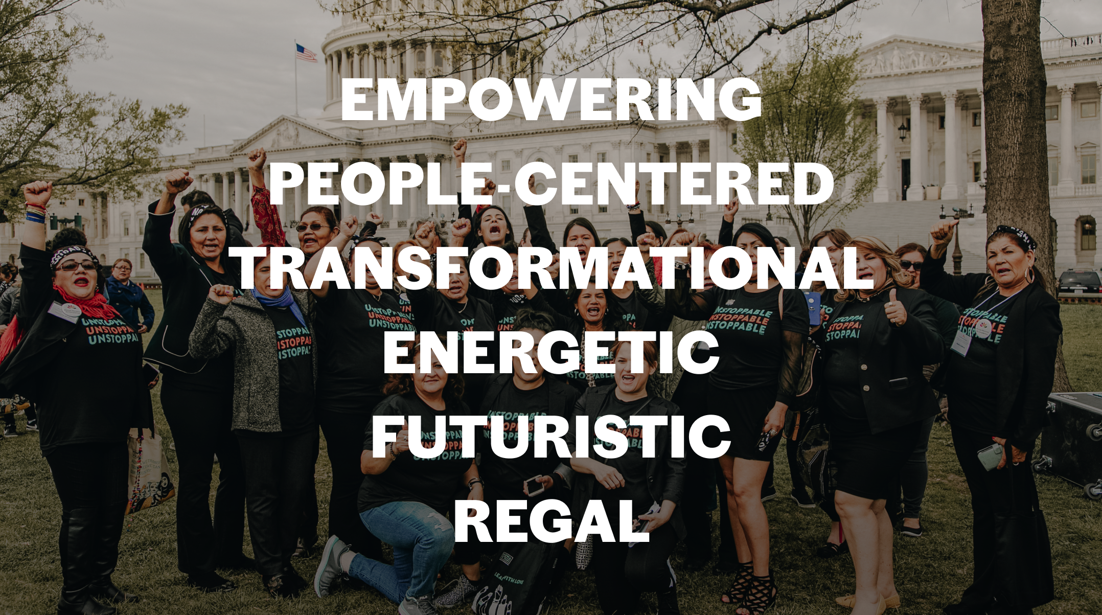
THE SOLUTION
We created a campaign creative identity that builds off of NDWA’s current branding and legacy while introducing new elements that showcases an empowering, regal and futuristic look and feel.
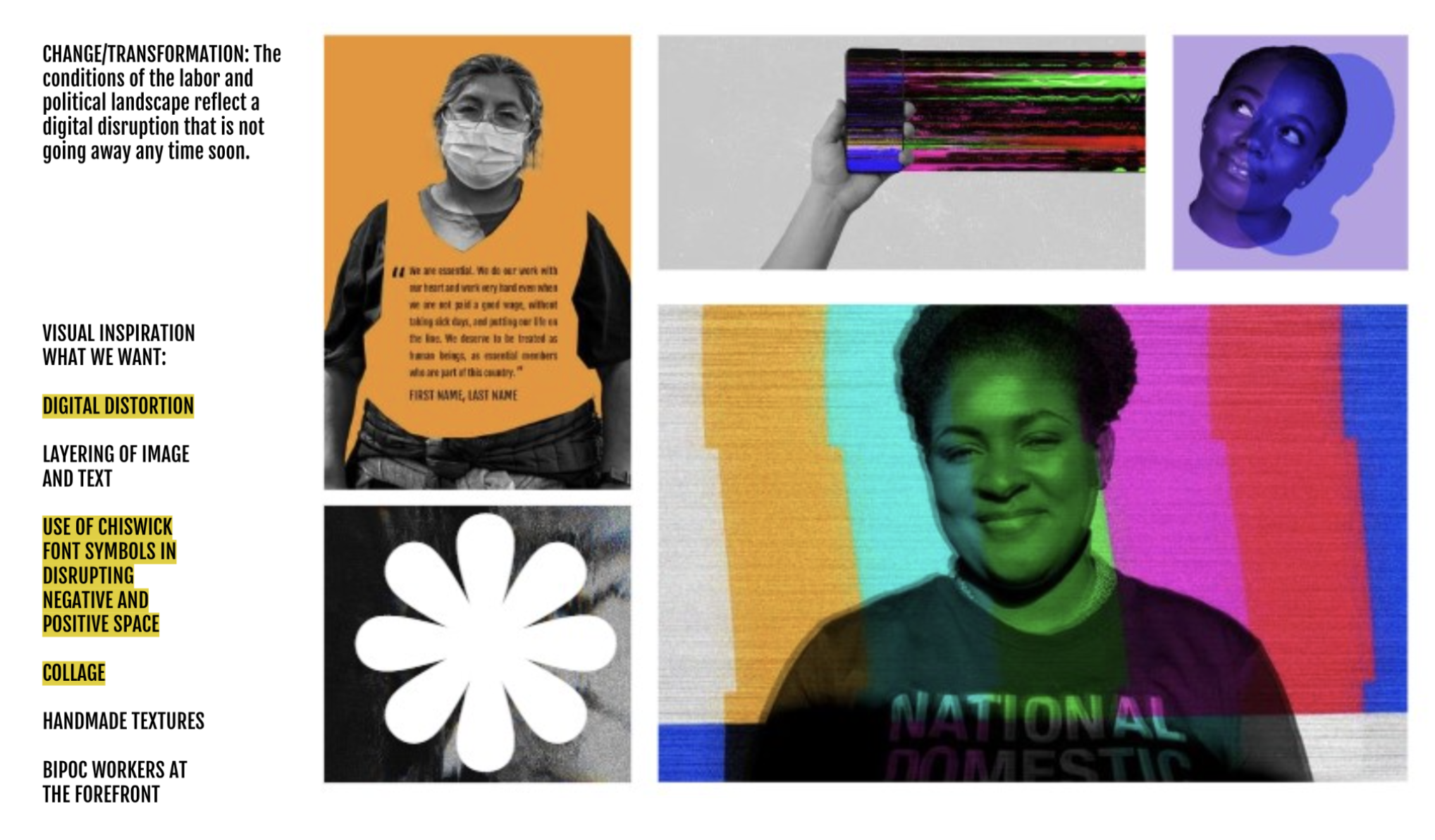
Why cyberpunk and afrofuturism?
One of the core values of the campaign is to reimagine domestic workers and the spaces they are in. The themes of cyberpunk and afrofuturism have themes in disruption, liberation, and reclamation, which strongly align with the goals of NDWA and honoring the past, present, and future of the organization.
The NDWA also aims to honor their Black domestic workers through their We Dream in Black chapter, which resonates heavily with the themes and values of afrofuturism.
*The client required that the color palette, typography and glyphs were maintained from NDWA’s current branding, which was developed by Champions Design.


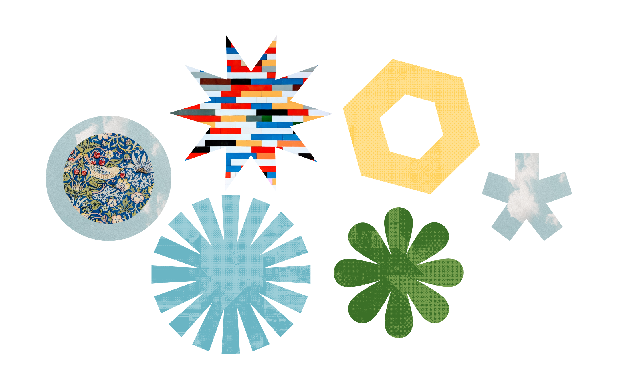
THE GLYPHS + PATTERNS
The glyphs were maintained from NDWA’s current branding, and draw inspiration from quilt patterns that are used by domestic workers.
The real life patterns masked in the vectors are inspired by styles in Afrofuturism, creating collage like patterns with the glyphs.
See Champions Design's Case Study
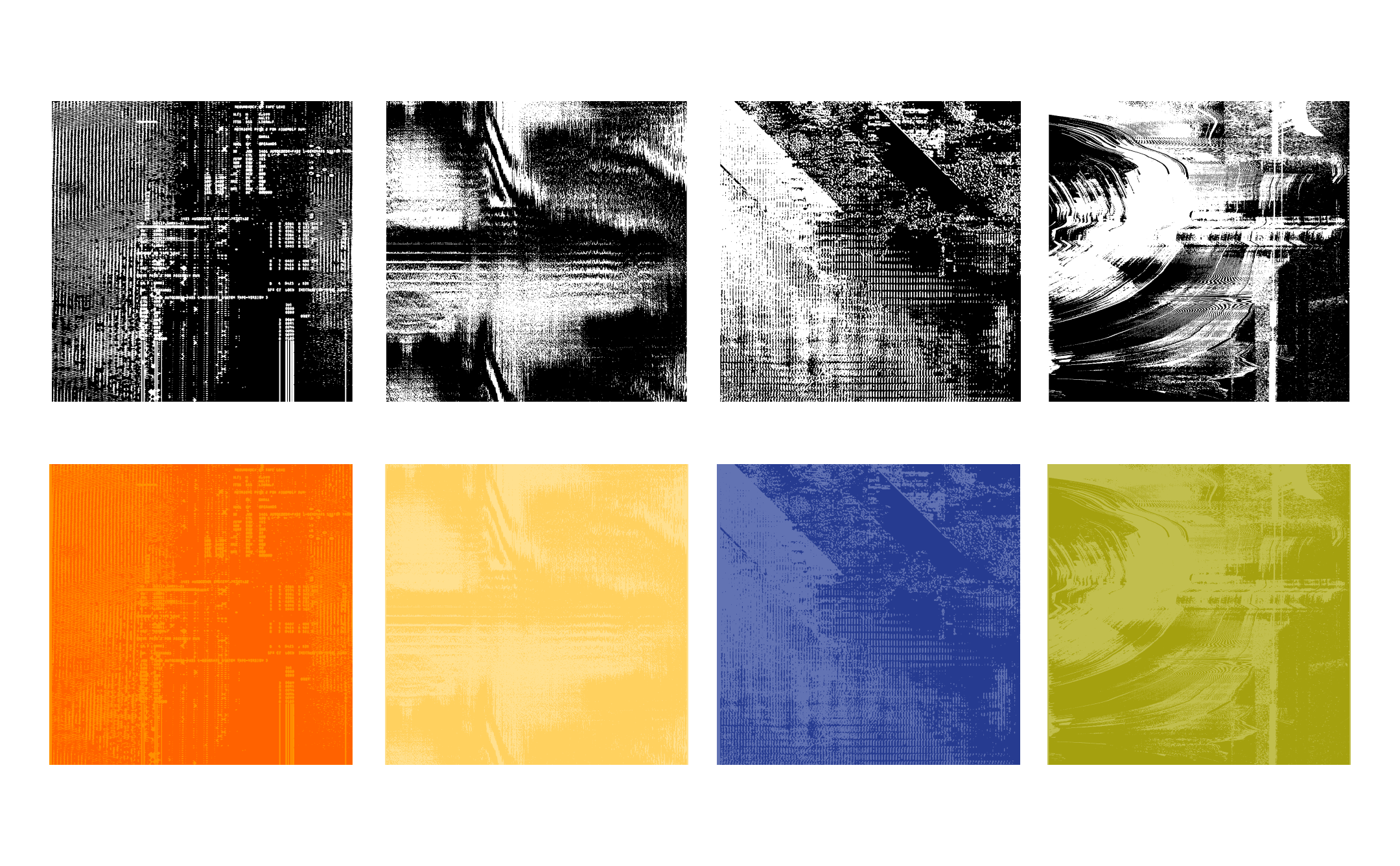
distortion texture
The client expressed wanting to incorporate
THE DELIVERABLES
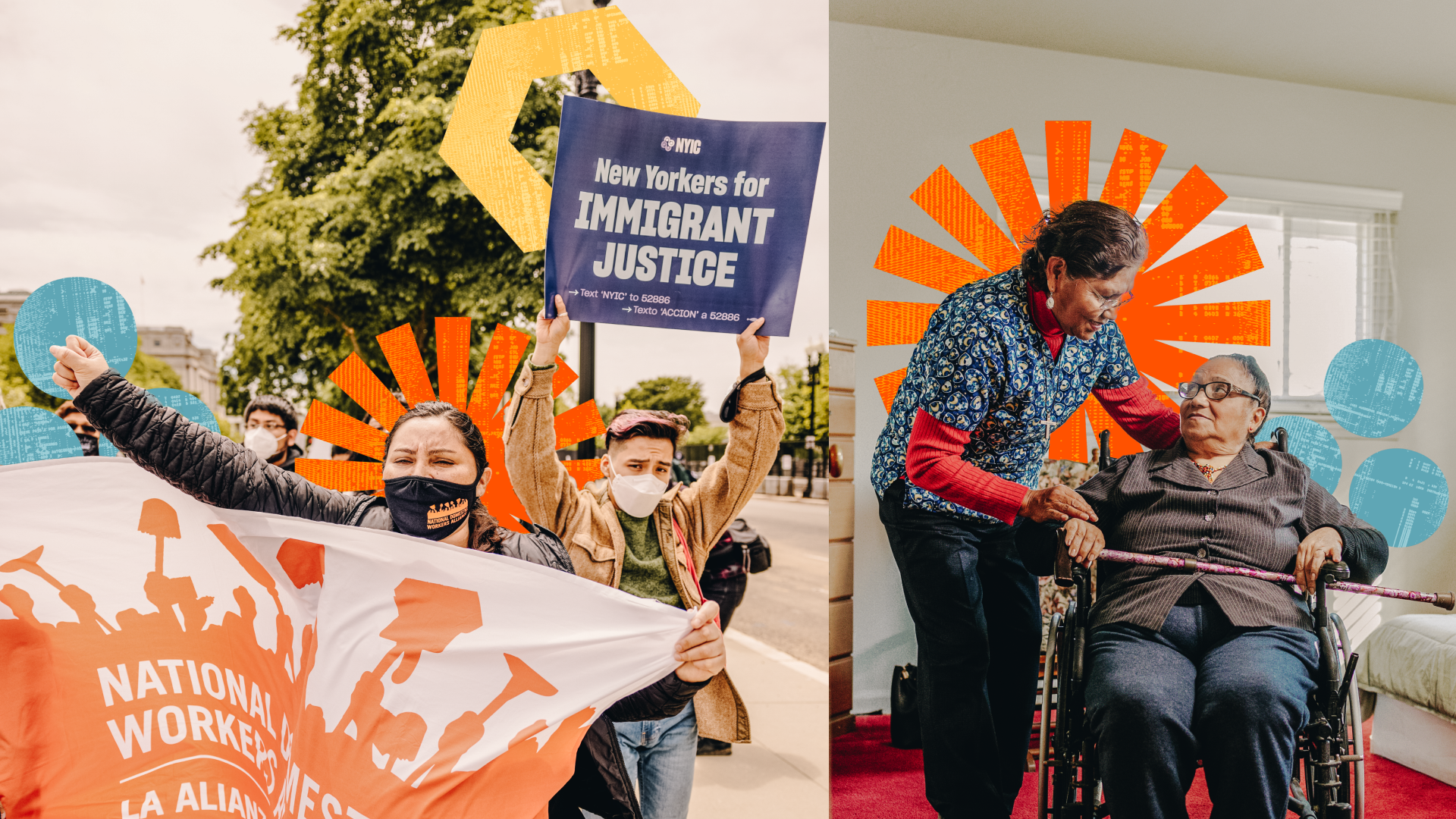
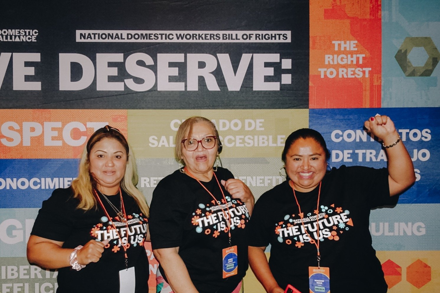
Deliverables included way-finding signage, social/digital assets, vinyl wraps, merchandise, print takeaways and immersive installations.
*All assets with the exception of merchandise, were needed in both English and Spanish.


Protest signage that uses language from NDWA’s past activations.


REFLECTION
At the end of this project, my team and I were all on-site for the event itself. We were able to celebrate directly alongside our client and see their faces light up as they saw themselves and their communities reflected in the visual identity. The creative enhanced the joy, hard work, and gratitude that our client’s community brought to the space.
